Gnailiew Café — Playful Brand Identity & Packaging System

Project overview
A character-driven café brand with a lizard mascot, inflated wordmark, and bold palette — built to live on cups, bags, stickers & merch.
Challenges
Standing out without overplaying it. Specialty coffee is a crowded category, and most independent cafés default to either minimalist sans-serifs or muted vintage marks. GNAILIEW needed a visual position far enough off-center to be memorable, but still feel like a place people would actually want to spend time in — not a gimmick. Finding that balance shaped every typography and color decision in the system.
Building a logo that doubles as a character. The owner's affection for lizards meant the mark had to do two jobs at once: function as a clean brand signature and read as a character with its own attitude. The lizard had to sit naturally inside an exaggerated, inflated wordmark — neither a literal mascot illustration nor a stiff icon — so the whole logo would feel like a single piece of street art.
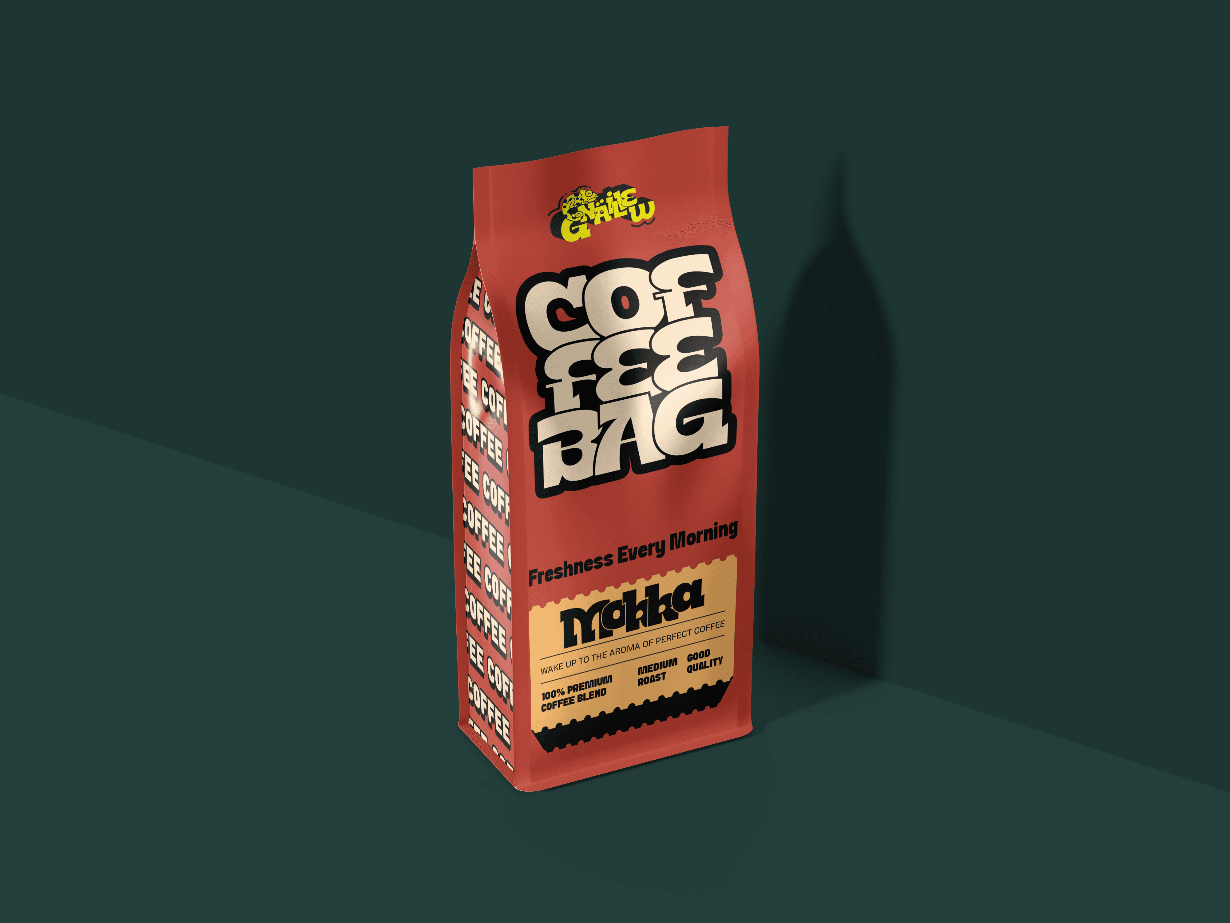
Holding the system together across very different touchpoints. The brand had to live on coffee cups, bread bags, takeaway boxes, bean packaging, drink bottles, aprons, tote bags, keychains, lanyards, window vinyl, and small collectibles like stickers and cloth labels. Each surface has a different shape, scale, and material, so the visual system needed flexible color blocks, secondary lettering, and repeatable layout patterns rather than a single fixed lockup.

Results
The finished identity gave GNAILIEW CAFE a visual world that travels well — instantly recognizable on a takeaway cup, equally at home on a sticker pressed onto someone's laptop. The high-saturation palette of blues, yellows, pinks and greens, the inflated comic-leaning lettering, and the ever-present lizard turned the brand into something customers actively want to collect and share, rather than passively consume. The system was built to extend — new product drops, seasonal packaging, and future merch can plug straight into the existing color and typography logic without redesigning from scratch.


Gnailiew Café — Playful Brand Identity & Packaging System
Project overview
A character-driven café brand with a lizard mascot, inflated wordmark, and bold palette — built to live on cups, bags, stickers & merch.
Challenges
Standing out without overplaying it. Specialty coffee is a crowded category, and most independent cafés default to either minimalist sans-serifs or muted vintage marks. GNAILIEW needed a visual position far enough off-center to be memorable, but still feel like a place people would actually want to spend time in — not a gimmick. Finding that balance shaped every typography and color decision in the system.
Building a logo that doubles as a character. The owner's affection for lizards meant the mark had to do two jobs at once: function as a clean brand signature and read as a character with its own attitude. The lizard had to sit naturally inside an exaggerated, inflated wordmark — neither a literal mascot illustration nor a stiff icon — so the whole logo would feel like a single piece of street art.
Holding the system together across very different touchpoints. The brand had to live on coffee cups, bread bags, takeaway boxes, bean packaging, drink bottles, aprons, tote bags, keychains, lanyards, window vinyl, and small collectibles like stickers and cloth labels. Each surface has a different shape, scale, and material, so the visual system needed flexible color blocks, secondary lettering, and repeatable layout patterns rather than a single fixed lockup.
Results
The finished identity gave GNAILIEW CAFE a visual world that travels well — instantly recognizable on a takeaway cup, equally at home on a sticker pressed onto someone's laptop. The high-saturation palette of blues, yellows, pinks and greens, the inflated comic-leaning lettering, and the ever-present lizard turned the brand into something customers actively want to collect and share, rather than passively consume. The system was built to extend — new product drops, seasonal packaging, and future merch can plug straight into the existing color and typography logic without redesigning from scratch.