AIJUIL3D — Brand Identity & Web Design for a 3D Print Studio
Project overview
How ilililab built a quiet, process-led brand and website for AIJUIL3D — a German 3D-printing studio balancing custom modelling and own product lines.
Challenges
Explaining a hybrid service-and-product studio in one site. Most studio sites pick one identity — agency or product brand — and lean into it. AIJUIL3D operates as both: custom modelling for clients, in-house printing as a service, an own product line sold direct, and small-batch runs for partner shops. The site had to make all four offers legible without forcing visitors to pick the wrong door, so the structure introduces the studio first and then splits cleanly into the ways of working with it.
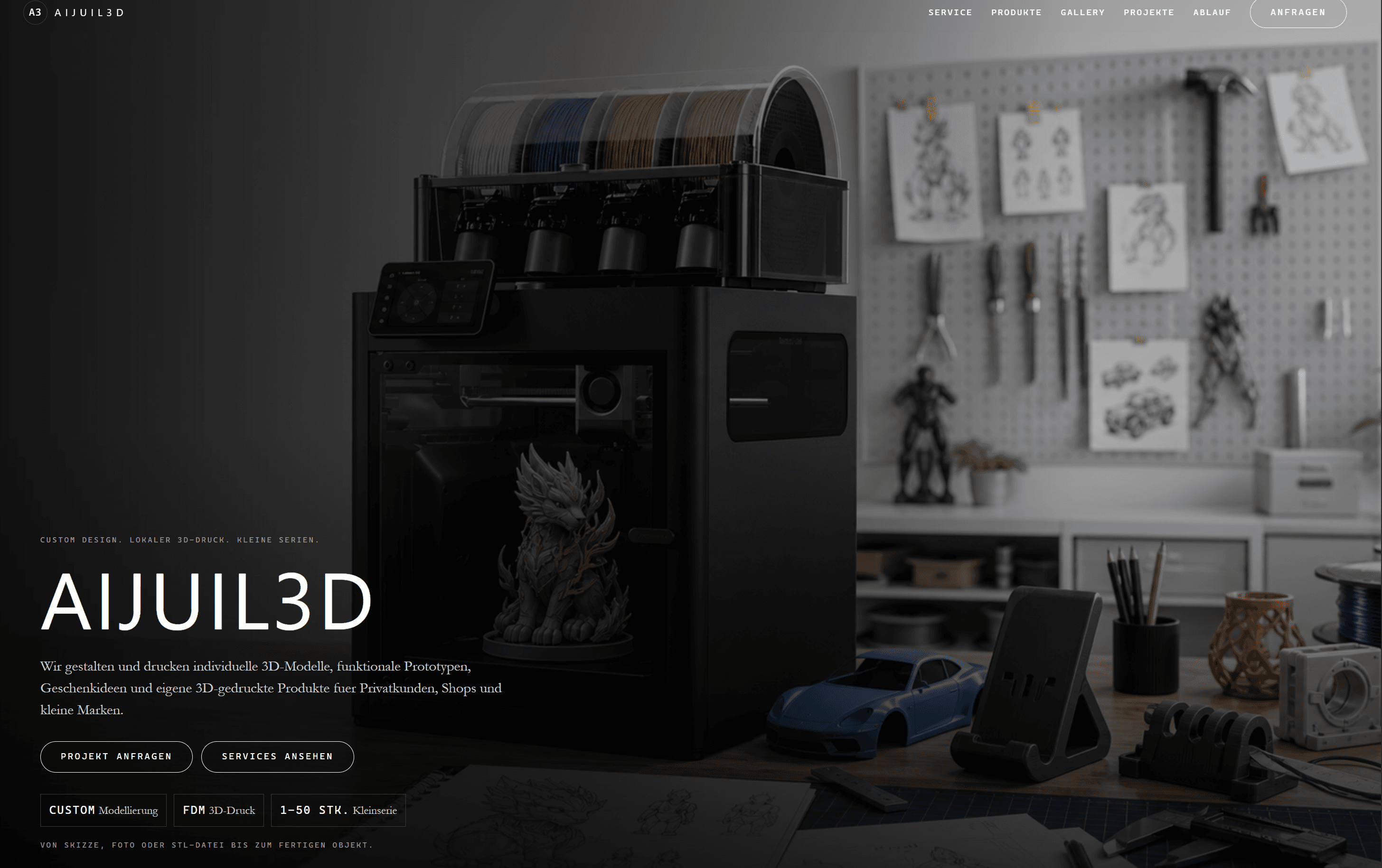
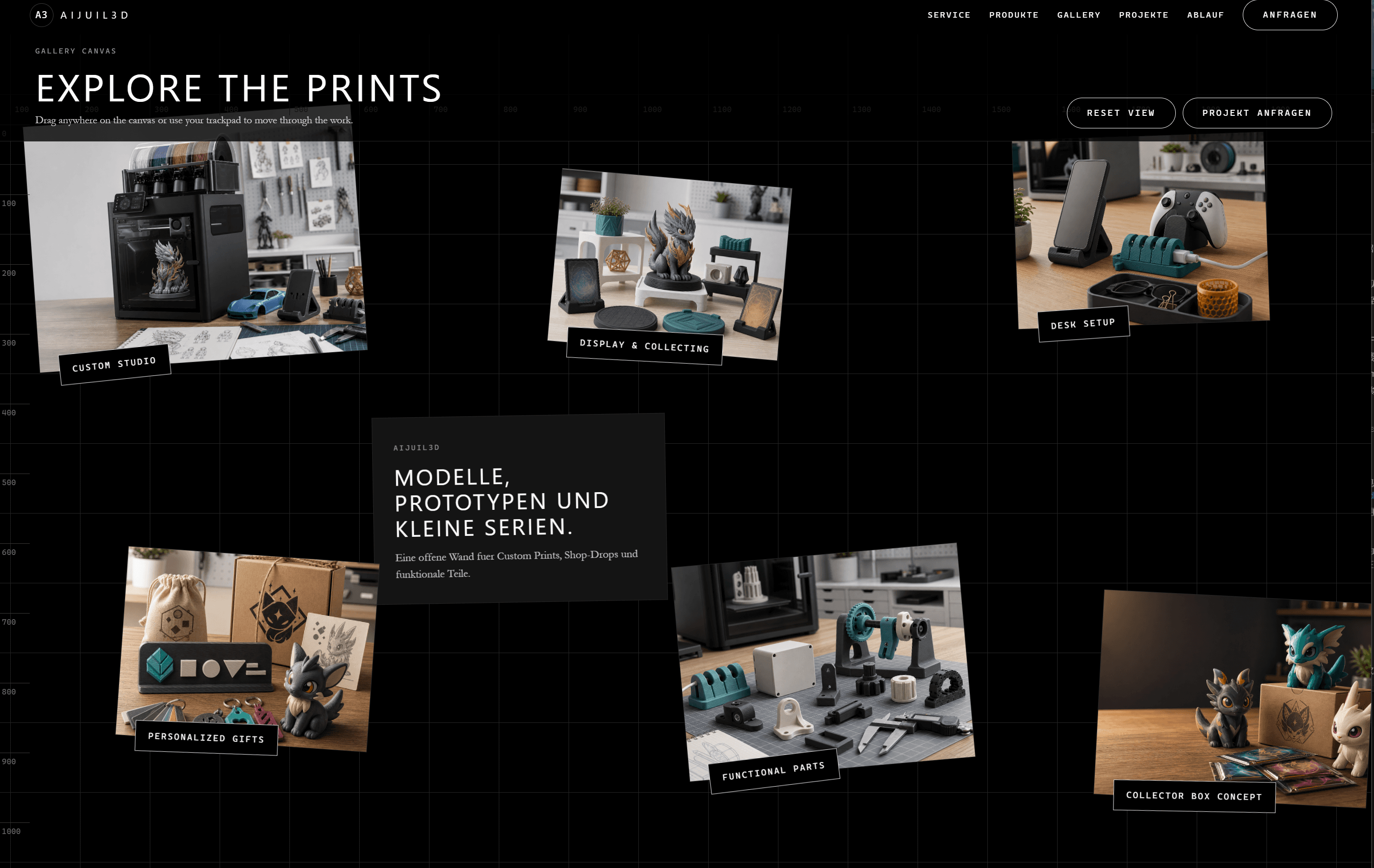
Avoiding the visual defaults of the maker-studio category. 3D-printing sites often reach for one of two looks: a high-volume product catalogue that reads like an electronics shop, or a hobbyist-feeling page heavy on hero shots of the printer itself. Neither matched AIJUIL3D's actual practice — small-batch, design-led, considered. The site needed a quieter visual language that puts finished objects and process ahead of machinery, while still signalling technical credibility.
Stating the studio's IP boundaries without sounding defensive. AIJUIL3D holds a firm line against commercial reproduction of protected characters or trademarks — a common request in the 3D-printing space. That stance is important to the brand but easy to communicate badly. The copy had to make the policy clear inside the working sections of the site, so it could function as a positioning statement on what the studio actually values, rather than as fine print buried in a footer.
Results
The finished site presents AIJUIL3D as one studio with four ways of working — custom design, on-demand printing, own products, and small-batch runs — connected by a single restrained visual system. A minimal sans-serif palette, product-led photography, and a transparent process walkthrough place the studio's actual output ahead of any hardware or branding flourish. The wording stays direct — "Von der Idee zum greifbaren Objekt", "Design zuerst" — and the studio's IP policy sits inside the work itself, not buried at the bottom of the page. New product drops, future services, and case studies plug into the same structure without breaking its tone.


AIJUIL3D — Brand Identity & Web Design for a 3D Print Studio
Project overview
How ilililab built a quiet, process-led brand and website for AIJUIL3D — a German 3D-printing studio balancing custom modelling and own product lines.
Challenges
Explaining a hybrid service-and-product studio in one site. Most studio sites pick one identity — agency or product brand — and lean into it. AIJUIL3D operates as both: custom modelling for clients, in-house printing as a service, an own product line sold direct, and small-batch runs for partner shops. The site had to make all four offers legible without forcing visitors to pick the wrong door, so the structure introduces the studio first and then splits cleanly into the ways of working with it.
Avoiding the visual defaults of the maker-studio category. 3D-printing sites often reach for one of two looks: a high-volume product catalogue that reads like an electronics shop, or a hobbyist-feeling page heavy on hero shots of the printer itself. Neither matched AIJUIL3D's actual practice — small-batch, design-led, considered. The site needed a quieter visual language that puts finished objects and process ahead of machinery, while still signalling technical credibility.
Stating the studio's IP boundaries without sounding defensive. AIJUIL3D holds a firm line against commercial reproduction of protected characters or trademarks — a common request in the 3D-printing space. That stance is important to the brand but easy to communicate badly. The copy had to make the policy clear inside the working sections of the site, so it could function as a positioning statement on what the studio actually values, rather than as fine print buried in a footer.
Results
The finished site presents AIJUIL3D as one studio with four ways of working — custom design, on-demand printing, own products, and small-batch runs — connected by a single restrained visual system. A minimal sans-serif palette, product-led photography, and a transparent process walkthrough place the studio's actual output ahead of any hardware or branding flourish. The wording stays direct — "Von der Idee zum greifbaren Objekt", "Design zuerst" — and the studio's IP policy sits inside the work itself, not buried at the bottom of the page. New product drops, future services, and case studies plug into the same structure without breaking its tone.