Fewo Witzenhausen — Brand & Website for a Family Holiday Rental
Project overview
Brand identity, illustration, web & print for fewo-witzenhausen — three family-run apartments in a Hessian organic-certified old town.
Challenges
Standing apart without losing warmth. Most independent vacation rentals end up looking either like a generic Booking.com tile or like an over-polished boutique hotel — neither of which fits a family-run apartment business. fewo-witzenhausen needed a visual identity that signalled care and personal attention without slipping into folksy cliché or amateur layout, so guests would feel they were renting from real people in a real place.
Anchoring the brand to its landscape. Witzenhausen's appeal is tightly tied to its surroundings — orchard-covered hillsides, the river Werra, walking trails, the old town's stepped streets — but most short-stay listings reduce that to a handful of stock photos and a paragraph of generic copy. The identity needed to bring the region into the brand itself, so the apartments would feel inseparable from the place they sit in, not interchangeable with any other holiday flat.
Designing a useful site for a one-family operation. Three apartments and one host means there is no booking team, no marketing department, and no margin for a heavy CMS. The site had to handle apartment listings, photo galleries, important guest information, and direct enquiries without becoming a maintenance burden — and the booking flow had to coexist with the family's existing Booking.com presence without confusing returning guests about where to reserve.


Results
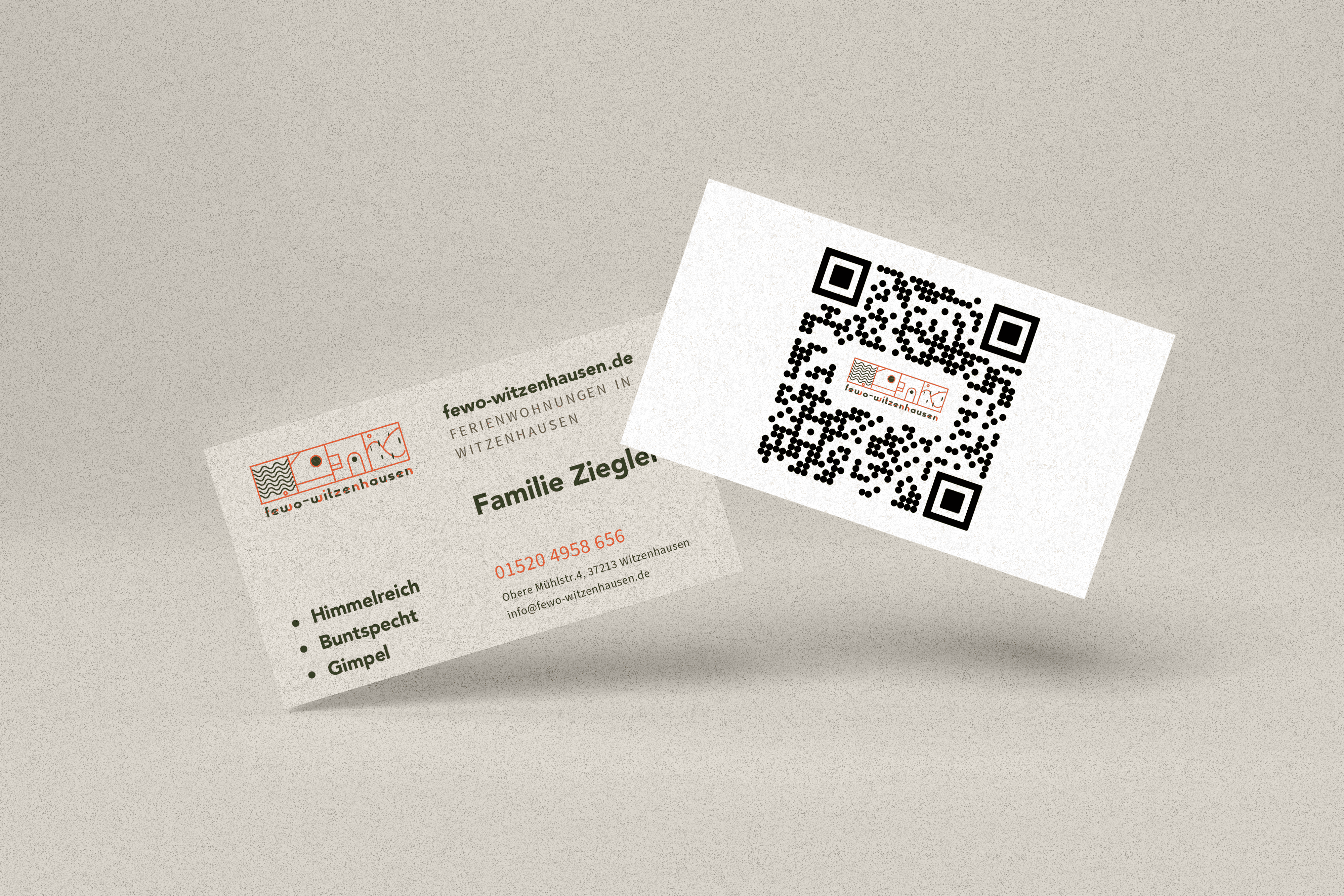
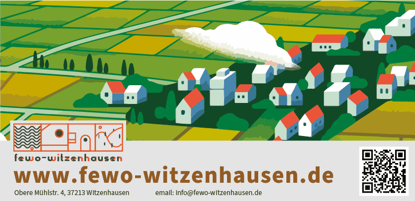
The finished identity gives Familie Ziegler a brand that carries the same warmth as a personal welcome at the door. A hand-drawn landscape — rolling Hessian hills, small houses with red rooftops, gentle clouds — sits at the heart of the system and ties together the website, business cards, and printed materials, so every touchpoint feels like part of the same small, place-rooted operation. The site presents all three apartments, gallery, guest information, and direct enquiry channels in a structure light enough for the family to maintain themselves. The visual system can absorb future apartments or seasonal collateral without losing its handmade character.


Fewo Witzenhausen — Brand & Website for a Family Holiday Rental
Project overview
Brand identity, illustration, web & print for fewo-witzenhausen — three family-run apartments in a Hessian organic-certified old town.
Challenges
Standing apart without losing warmth. Most independent vacation rentals end up looking either like a generic Booking.com tile or like an over-polished boutique hotel — neither of which fits a family-run apartment business. fewo-witzenhausen needed a visual identity that signalled care and personal attention without slipping into folksy cliché or amateur layout, so guests would feel they were renting from real people in a real place.
Anchoring the brand to its landscape. Witzenhausen's appeal is tightly tied to its surroundings — orchard-covered hillsides, the river Werra, walking trails, the old town's stepped streets — but most short-stay listings reduce that to a handful of stock photos and a paragraph of generic copy. The identity needed to bring the region into the brand itself, so the apartments would feel inseparable from the place they sit in, not interchangeable with any other holiday flat.
Designing a useful site for a one-family operation. Three apartments and one host means there is no booking team, no marketing department, and no margin for a heavy CMS. The site had to handle apartment listings, photo galleries, important guest information, and direct enquiries without becoming a maintenance burden — and the booking flow had to coexist with the family's existing Booking.com presence without confusing returning guests about where to reserve.
Results
The finished identity gives Familie Ziegler a brand that carries the same warmth as a personal welcome at the door. A hand-drawn landscape — rolling Hessian hills, small houses with red rooftops, gentle clouds — sits at the heart of the system and ties together the website, business cards, and printed materials, so every touchpoint feels like part of the same small, place-rooted operation. The site presents all three apartments, gallery, guest information, and direct enquiry channels in a structure light enough for the family to maintain themselves. The visual system can absorb future apartments or seasonal collateral without losing its handmade character.